Where 2014 would rank if global temperature reverted to the 1979-2013 trend
Given that 2014 is nearly over (~3 weeks to go), we're going to be hearing even more about the possibility that 2014 will be the warmest year in the instrumental record. I myself made the pile higher and deeper with my last post. That raised a question in my mind: Where should global temperature be in 2014 according to the warming trend since 1979 (the first full year of the satellite record)?
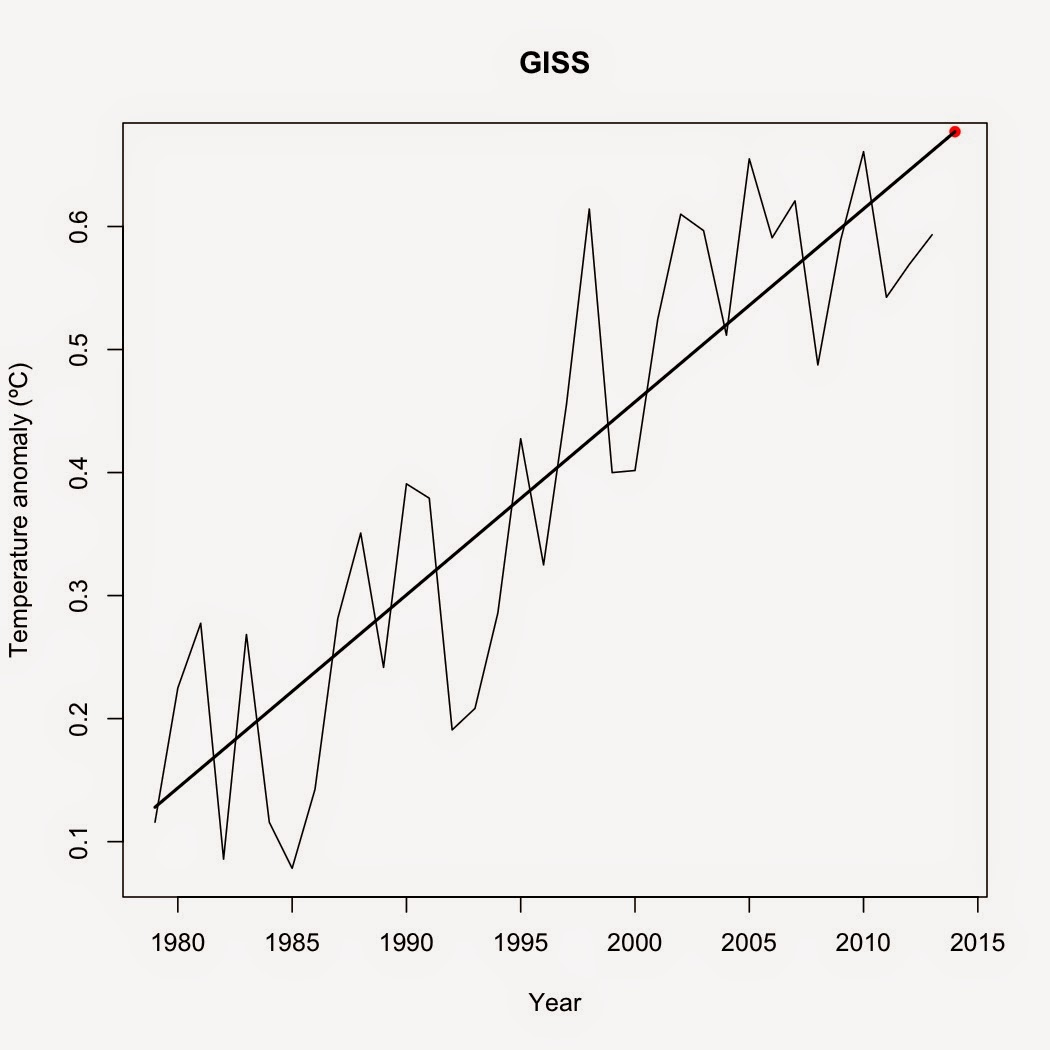
For this, I calculated the yearly average temperature since 1979 for UAH, GISS, NCDC, and coverage-corrected HadCRUT4. I tested each data set for autocorrelation, then calculated the 1979-2013 trend for each data set and predicted the average 2014 temperature from those trends. Using that prediction, I ranked each year by average yearly temperature. Here are the top five years according to those data sets.
UAH
1998 (0.42ºC)
2010 (0.40ºC)
2005 (0.262ºC)
2014 (0.259ºC)
2013 (0.236ºC)

GISS
2014 (0.677ºC)
2010 (0.661ºC)
2005 (0.655ºC)
2007 (0.621ºC)
1998 (0.614ºC)
NCDC
2014 (0.678ºC)
2010 (0.651ºC)
1998 (0.632ºC)
2003 (0.617ºC)
2013 (0.616ºC)

Coverage-corrected HadCRUT4
2010 (0.635ºC)
2014 (0.629ºC)
2005 (0.592ºC)
2007 (0.568ºC)
2009 (0.561ºC)

There you have it. If the 1979-2013 trend prevails, 2014 will go down as the hottest year in the GISS and NCDC temperature records, the second hottest year in the coverage-corrected HadCRUT4 record, and the fourth hottest year in the UAH record. Year-to-date, it's already the hottest year for NCDC, the second hottest year for GISS and coverage-corrected HadCRUT4, and the third-hottest year for UAH. Not too bad for an ENSO neutral year. What should be clear to everyone is that global warming didn't somehow magically stop in 1998.
For this, I calculated the yearly average temperature since 1979 for UAH, GISS, NCDC, and coverage-corrected HadCRUT4. I tested each data set for autocorrelation, then calculated the 1979-2013 trend for each data set and predicted the average 2014 temperature from those trends. Using that prediction, I ranked each year by average yearly temperature. Here are the top five years according to those data sets.
There you have it. If the 1979-2013 trend prevails, 2014 will go down as the hottest year in the GISS and NCDC temperature records, the second hottest year in the coverage-corrected HadCRUT4 record, and the fourth hottest year in the UAH record. Year-to-date, it's already the hottest year for NCDC, the second hottest year for GISS and coverage-corrected HadCRUT4, and the third-hottest year for UAH. Not too bad for an ENSO neutral year. What should be clear to everyone is that global warming didn't somehow magically stop in 1998.


Comments
Post a Comment